Introduction
I like cycling, and as so many, I put my rides on Strava. And the other day, at the end of 2020, I received my year-end list from Strava; I guess it was the time for lists, as plenty of lists abound at that moment. The Strava overview was a slick presentation of my cycling efforts, and some of the plots looked nice enough for me to think: “can I make these in R myself?”. For instance, this graph I thought looked pretty good:
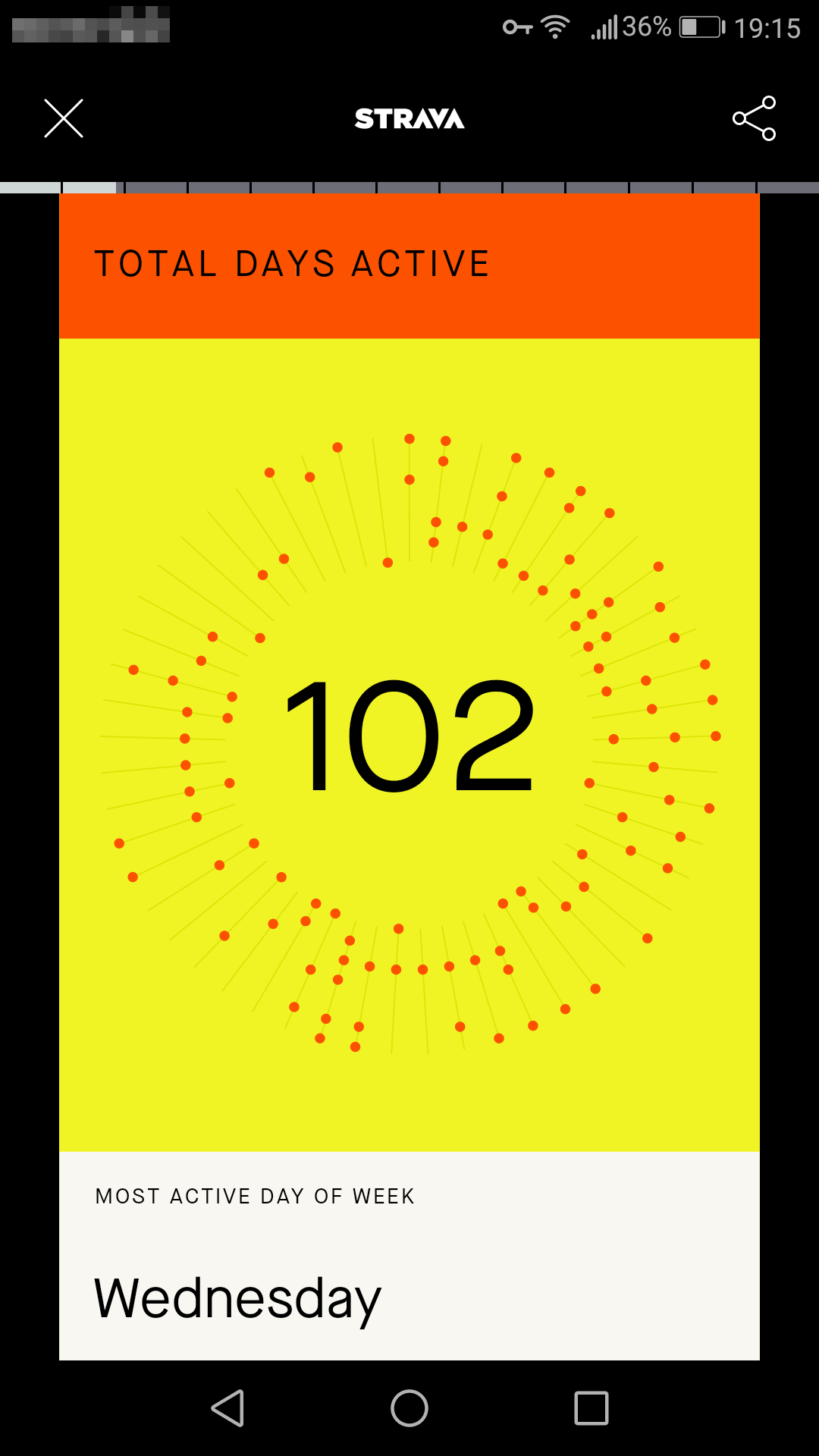
Off course, scientifically the figure is awful, since it’s lacking axes, it’s hard to read, etc. And still, visually I find it appealing: it’s literally a year-round depiction of my cycling activities. So, here goes plotting in R.
It had been a while since I ventured to import my cycling data into R, so I needed to try some tools before succeeding. This is the write-up of importing the data and making some visualizations.
Packages needed
library(lubridate)##
## Attaching package: 'lubridate'## The following objects are masked from 'package:base':
##
## date, intersect, setdiff, unionlibrary(FITfileR)
library(gridExtra)
library(grid)
library(gtable)
library(feather)
library(tidyverse)## ── Attaching packages ─────────────────────────────────────── tidyverse 1.3.0 ──## ✓ ggplot2 3.3.0 ✓ purrr 0.3.4
## ✓ tibble 3.0.4 ✓ dplyr 1.0.2
## ✓ tidyr 1.1.0 ✓ stringr 1.4.0
## ✓ readr 1.3.1 ✓ forcats 0.5.0## ── Conflicts ────────────────────────────────────────── tidyverse_conflicts() ──
## x lubridate::as.difftime() masks base::as.difftime()
## x dplyr::combine() masks gridExtra::combine()
## x lubridate::date() masks base::date()
## x dplyr::filter() masks stats::filter()
## x lubridate::intersect() masks base::intersect()
## x dplyr::lag() masks stats::lag()
## x lubridate::setdiff() masks base::setdiff()
## x lubridate::union() masks base::union()Importing data
I can see from my old script and the setwd that I apparently played around with .fit files when I was still on Windows. By the looks of it, this was during a conference, after a morning run. Now, a few years later, I used this script as a starting point.
Back then, I used the fit package that I found here. Besides having initial issues installing devtools, it turned out the fit package is not compatible with my version of R. Since there hasn’t been a recent update on that GitHub page it could well be that it is outdated. Another package that I then came across is fitdc, that is found here. Installing this package was easy, since it is on cran. Despite the GitHub page being archived, and the last update stemming from 4 years ago, the package still worked, simply following the vignette mentioned on the Cran package page. However, going through its workflow, the way things are done seemed a bit elaborate.
So, I went and looked for a different package: something simpler to work with, and preferably updated relatively recently. That’s when I found FITfileR, written by Mike L. Smith. He explains using it on his personal website. And it seemed to be what I was looking for, so I used this for the analyses below.
So, first import my fit files:
# fit_files <- list.files(pattern = "\\.fit$")

# Include all FIT files in subdirectories, and include folder names
fit_files <- list.files(path = "/media/storage/Programming/Fietsanalyse/",
                        pattern = "\\.fit$",
                        include.dirs = TRUE,
                        recursive = TRUE,
                        full.names = TRUE)

# Read in multiple files into a list of data
bikedata <- map(fit_files, readFitFile)

# Pull records from bikedata of one data file from that list
# bike2_records <- records(bikedata[[2]]) %>%
#         bind_rows() %>%
#         arrange(timestamp) %>%
#         drop_na(distance)
#
# bike2_records

# Now, how to pull records from all data in that list?
read_records_fun <- function(x) {
  records(x) %>%
        bind_rows() %>%
        arrange(timestamp) %>%
        drop_na(distance)
}

bike_records <- map(bikedata, read_records_fun)

# bike_records[1]

rm(bikedata)
Especially mapping the readFitFile() function over many fit files took a while (think minutes), and took up quite a bit of memory. For 98 fit files I see I needed 2.2Gb of RAM. This call resulted in an object of class FitFile. From this, we can then pull records using the records() function. I made my own wrapper, that immediately binds the rows of records that belong to the same activity, arranges on timestamp, and drops NA’s in the timestamp variable. Your final results will then be a list of cycling record tibbles, each tibble containing the data of one activity. Depicted below you see my first activity of 2020. I blurred the lattitude and longitude, since I don’t necessarily need my or other people’s address all over the internet.

Pull date, distance and power from each df in the bike_records list
For the figure that I had in mind, we wouldn’t need all that information. What the Strava picture plots is simply a dot for each date that I was on my road bike or indoor trainer. Below, I pull dates from the activities, but since I might use some other variables for other purposes, I decided to pull distance and power from the records, too. When using the final row of distance, I knew how long my ride was. Power on the other hand is only measured when I’m using my indoors bike trainer - I don’t have a power meter on my road bike - , so I used this variable to distinguish between going outside for a bike ride, or riding a bike indoors (bad weather, dark, …).
So, in this code block I filtered the last row of each tibble. These last rows of each tibble are then bound together, and arranged according to date. The resulting tibble is printed: 15 variables, containing the 10 variables visible in the picture below, plus compressed_speed_distance, grade, resistance, cycle_length, and temperature. Only the first six variables are output from my Garmin 310XT watch, while my Tacx trainer gives all 15 variables as output.
filter_dist_all_fun <- function(x) {
  x %>%
    arrange(desc(timestamp)) %>%
    slice(1)
}

dist_filt_bike_records <- map(bike_records, filter_dist_all_fun)

dist_filt_bike_records <- dist_filt_bike_records %>%
  bind_rows() %>%
  arrange(timestamp)

# dist_filt_bike_records
combined activities tibble
Also printed is a table() output answering the question whether I biked outdoors - based on is.na and the power variable.
table("Did I bike outdoors?" = is.na(dist_filt_bike_records$power))## Did I bike outdoors?
## FALSE TRUE
## 43 55In the following code block, I selected the date, the final distance of the activity, and the power value from this tibble. At the same time, I added new variables:
virtual: is the activity a “virtual” ride, a.k.a. riding indoors on my trainer?index: numbering all activities 1 till 98dist_km: distance of the activity, in kilometers; the original distance variable is in metersdate: date of activity based on thetimestampvariableweekday: day of the week, based on thetimestampvariable, and ordered from Monday till Sundayweeknumber: number of the week the activity was in, based on thetimestampvariable
Creating the weekday variable needed me to set the time internationalization of R. My default is Dutch, so the default weekdays output is days of the week in Dutch. By setting the time aspect of the locale to “C”, the days of the week were now set to English.
Sys.setlocale("LC_TIME", "C")## [1] "C"# dist_2020 <- dist_2020 %>%
dist_2020 <- dist_filt_bike_records %>%
select(timestamp, distance, power) %>%
mutate(virtual = case_when(is.na(power) ~ "no",
TRUE ~ "yes")) %>%
mutate(index = 1:nrow(.)) %>%
mutate(dist_km = round(distance/1000, 2)) %>%
mutate(date = as.Date(timestamp)) %>%
mutate(weekday = weekdays(timestamp)) %>%
mutate(weekday = factor(weekday, levels = c("Monday", "Tuesday", "Wednesday", "Thursday", "Friday", "Saturday", "Sunday"))) %>%
mutate(weeknumber = isoweek(timestamp)) %>%
select(index, everything(), -power)Plot activities
Now we had enough to plot the activities. For instance, below are plotted, the weeknumber on the x-axis, and weekday on the y-axis. Plotted as points, this will show a point for each activity that took place on a certain date. This is the base for the Strava plot. In this plot, I added colour for cycling indoors (blue) and outdoors (red), and increasing size of the points for distance.
dist_2020 %>%
  ggplot(aes(x = weeknumber, y = weekday)) +
  geom_point(alpha = 0.5, aes(colour = virtual, size = dist_km)) +
  scale_x_discrete(breaks = 1:53) +
  scale_y_discrete(limits = c("Empty", "Monday", "Tuesday", "Wednesday", "Thursday", "Friday", "Saturday", "Sunday"),
                   # breaks = c("Empty", "Monday", "Tuesday", "Wednesday", "Thursday", "Friday", "Saturday", "Sunday"),
                   drop = FALSE)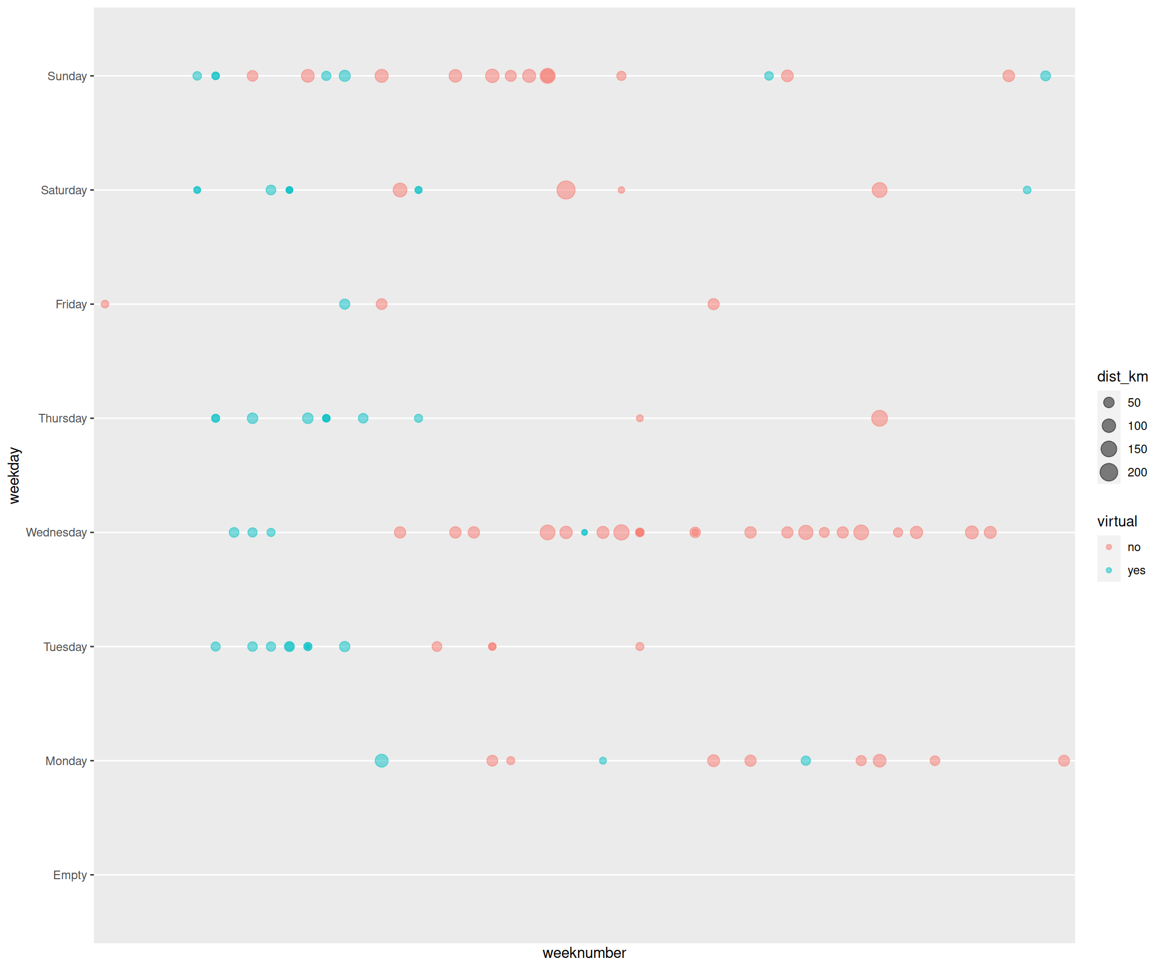
Strava-like plot base
The above ggplot we then used as basis to build the aformentioned strava plot. It’s the plot as we see above, but then in a circular form. One can plot this by using coord_polar.
dist_2020 %>%
  ggplot(aes(x = weeknumber, y = weekday)) +
  geom_point() +
  scale_x_discrete(breaks = 1:53) +
  coord_polar()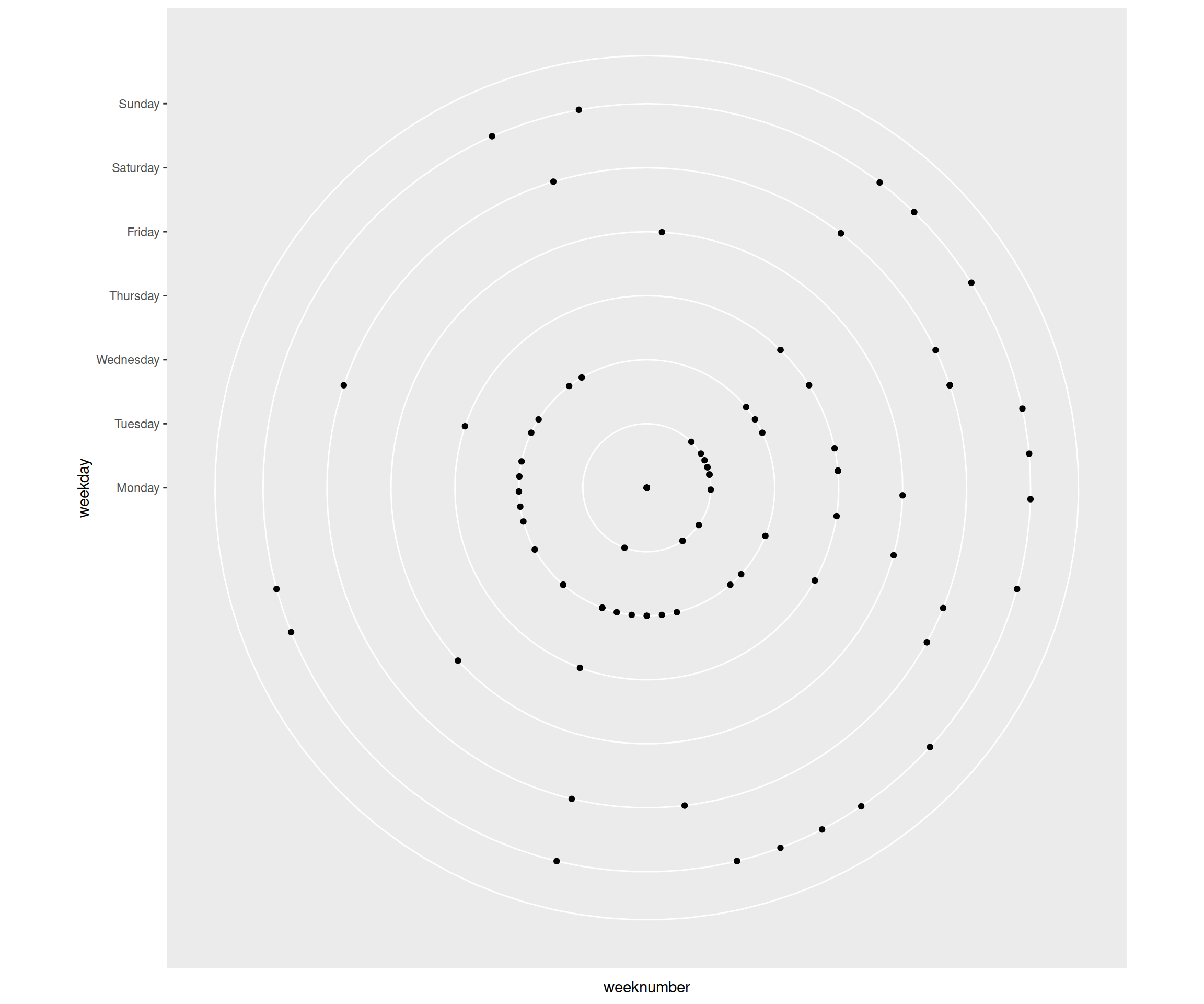
Adjust Strava-like plot
As you can see, it was going the right way, but some parts of the plot needed to be edited/set manually to make the plot look more like the original Strava plot.
Looking at the above plot, the following needed to be edited:
- make empty space in the middle, in order to make the separate points for Mondays visible; now they were all condensed to a single point
- use
scale_y_discrete(): the more “Empty” you add to limits, the bigger the empty space in the middle
- use
- add the “week lines” that are drawn through the points belonging to the same week
- use
geom_segment(), and use as input datadf2that I made telling to draw each line from Monday to Sunday
- use
- get rid of the ticks and tick labels
- use
theme_void()
- use
- get rid of the axes labels
- use
theme_void()
- use
- change colour and size of activity points
- set colour and size within
geom_point()
- set colour and size within
- change background colour
- use
theme()
- use
This resulted in the following plot:
df2 <- tibble(weeknumber = 1:53, lower = "Monday", upper = "Sunday")

p <- dist_2020 %>%
  ggplot(aes(x = weeknumber, y = weekday)) +
  # geom_point(alpha = 0.5, aes(colour = virtual, size = dist_km)) +
  # geom_vline(xintercept = c(1:53), colour= "lightgrey") +
  geom_segment(data = df2, aes(x = weeknumber, y = lower, xend = weeknumber, yend = upper), colour = "grey85", size = 0.3) +
  geom_point(colour = "#fc4c02", size = 3) +
  scale_x_discrete(breaks = 1:53) +
  coord_polar() +
  theme_void() +
  # add dummy variables to y-axis, to create hole in the middle of your circular plot (Empty * n) and bit of space on the outside (EmptyOut)
  scale_y_discrete(limits = c("Empty", "Empty", "Empty", "Empty", "Empty", "Empty", "EmptyIn", "Empty", "Monday", "Tuesday", "Wednesday", "Thursday", "Friday", "Saturday", "Sunday", "EmptyOut"),
                   # breaks = c("Empty", "Monday", "Tuesday", "Wednesday", "Thursday", "Friday", "Saturday", "Sunday"),
                   drop = FALSE) +
  theme(plot.background = element_rect(fill = 'yellow')) # change colour background

p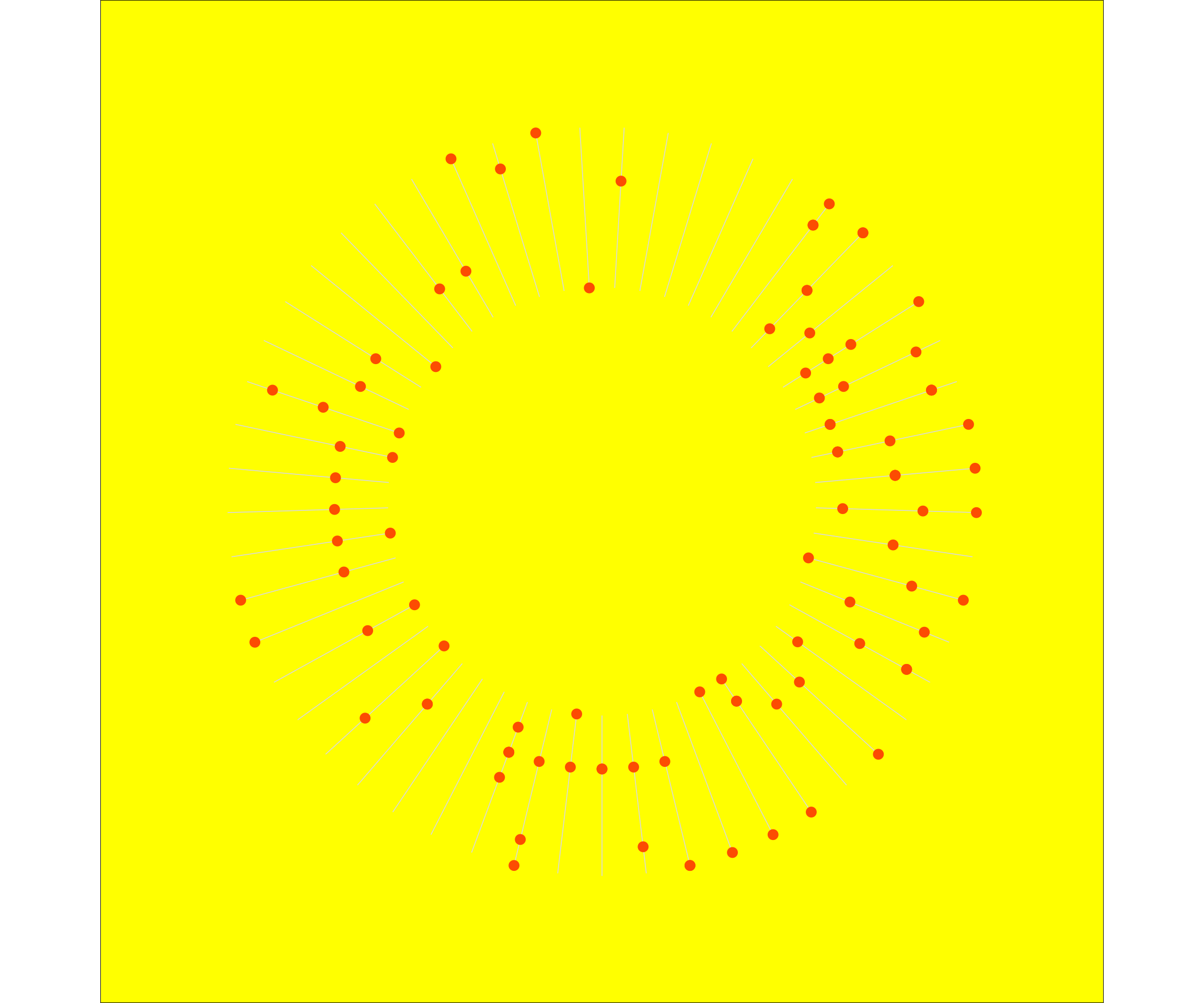
Additionally, you can play around with the margins around the graph, also within the theme() function.
p1 <- dist_2020 %>%
  ggplot(aes(x = weeknumber, y = weekday)) +
  # geom_point(alpha = 0.5, aes(colour = virtual, size = dist_km)) +
  # geom_vline(xintercept = c(1:53), colour= "lightgrey") +
  geom_segment(data = df2, aes(x = weeknumber, y = lower, xend = weeknumber, yend = upper), colour = "grey85", size = 0.3) +
  geom_point(colour = "#fc4c02", size = 3) +
  scale_x_discrete(breaks = 1:53) +
  coord_polar() +
  theme_void() +
  scale_y_discrete(limits = c("Empty", "Empty", "Empty", "Empty", "Empty", "Empty", "EmptyIn", "Empty", "Monday", "Tuesday", "Wednesday", "Thursday", "Friday", "Saturday", "Sunday", "EmptyOut"),
                   # breaks = c("Empty", "Monday", "Tuesday", "Wednesday", "Thursday", "Friday", "Saturday", "Sunday"),
                   drop = FALSE) +
  theme(plot.background = element_rect(fill = 'yellow'),
        plot.margin = unit(c(50, 20, 40, 20), "pt"))

p1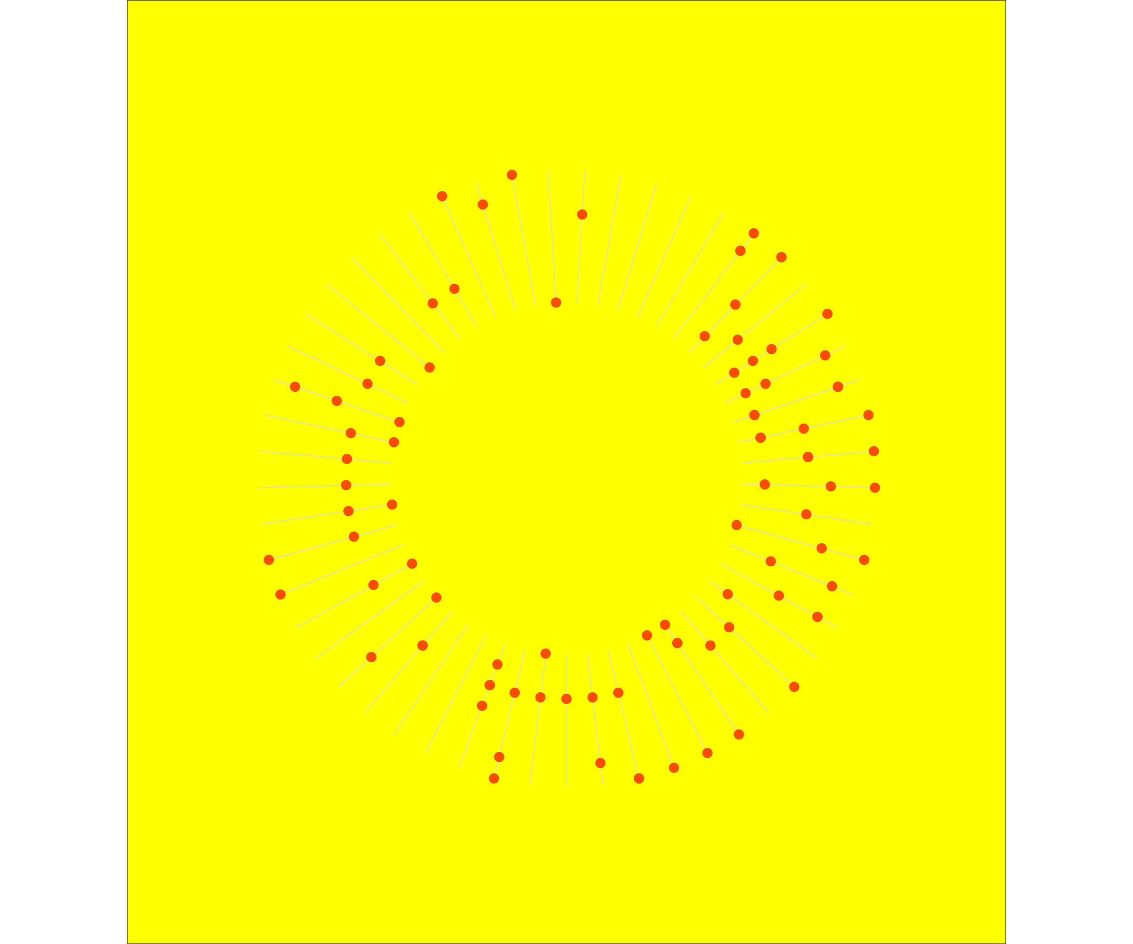
One thing I was missing still is the total number of activities, plotted in the center of the graph. This is a relatively simple addition, via annotate().
p1 +
annotate("text", x=0, y=0, label = nrow(dist_2020), size = 35)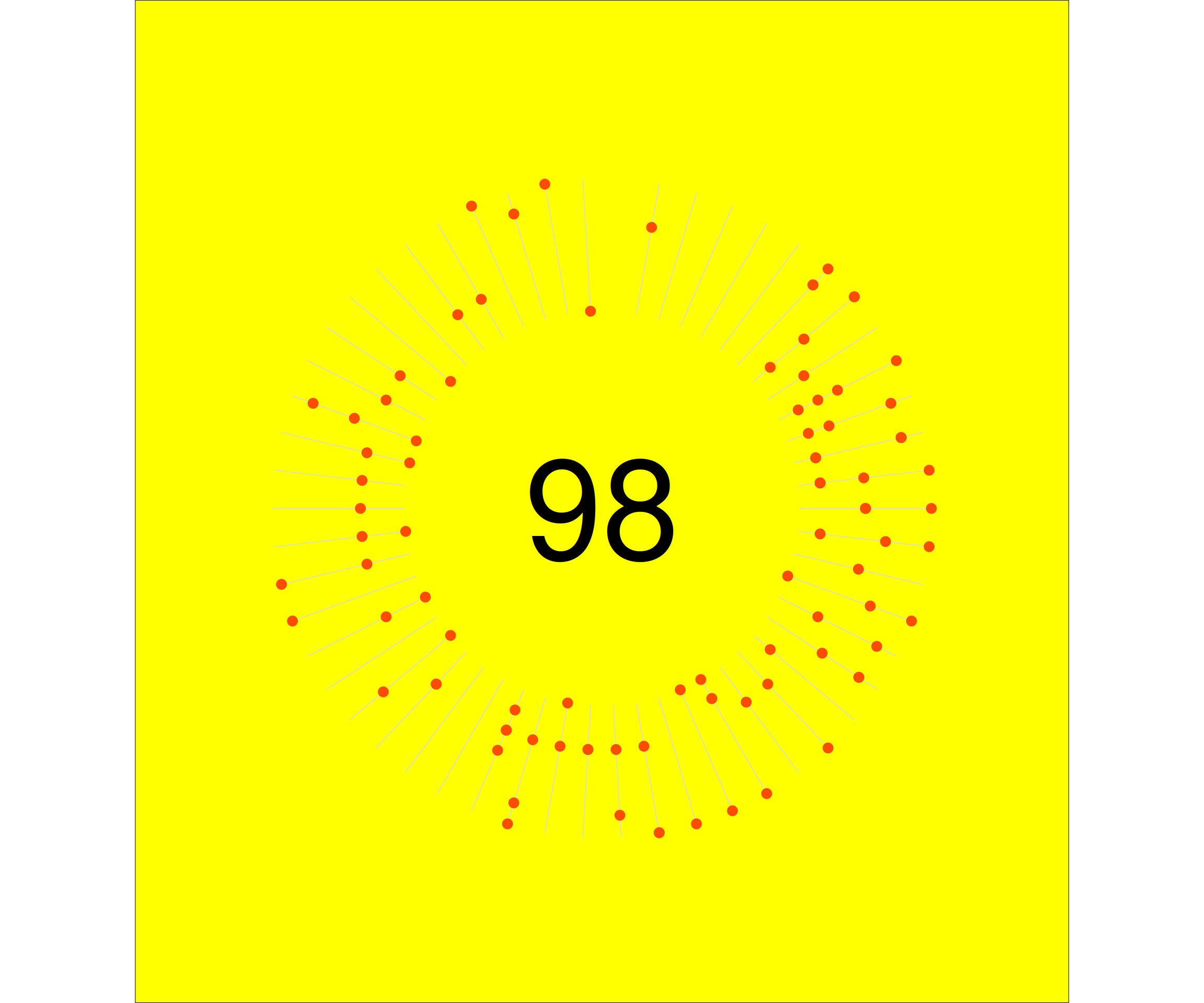 You will probably notice that the plot is very much alike the strava plot. The number in the center is slightly lower. This is a.o. because the first n activities of the year were on a different platform, that did not have .fit file export. I didn’t bother importing the gpx files from these.
Adjust plot dimensions and outside-plot-canvas colours
So, now this plot mostly looked like what I got from Strava. You can also play around a bit with dimensions and the colours around the plot.
So first I set the margins to mimic the dimensions of the original graph. This is without changing the background colours of the rectangle outisde the plot.
p2 <- dist_2020 %>%
  ggplot(aes(x = weeknumber, y = weekday)) +
  # geom_point(alpha = 0.5, aes(colour = virtual, size = dist_km)) +
  geom_segment(data = df2, aes(x = weeknumber, y = lower, xend = weeknumber, yend = upper), colour = "grey85", size = 0.3) +
  geom_point(colour = "#fc4c02", size = 3) +
  scale_x_discrete(breaks = 1:53) +
  coord_polar() +
  theme_void() +
  annotate("text", x=0, y=0, label = nrow(dist_2020), size = 35) +
# add dummy variables to y-axis, to create hole in the middle of your circular plot (Empty * n) and bit of space on the outside (EmptyOut)
  scale_y_discrete(limits = c("Empty", "Empty", "Empty", "Empty", "Empty", "Empty", "Empty", "Empty", "Monday", "Tuesday", "Wednesday", "Thursday", "Friday", "Saturday", "Sunday", "EmptyOut"),
                   # breaks = c("Empty", "Monday", "Tuesday", "Wednesday", "Thursday", "Friday", "Saturday", "Sunday"),
                   drop = FALSE) +
# set plot background to colour of choice, and increase margins of plot to create space around plot
  theme(#panel.background = element_rect(fill = "yellow"), # , color = "pink"
        plot.margin = unit(c(150, 0, 200, 0), "pt"), # top, right, bottom, left
        # panel.border = element_line(colour = "yellow") # element_blank()
        plot.background = element_rect(fill = "yellow")
        )

p2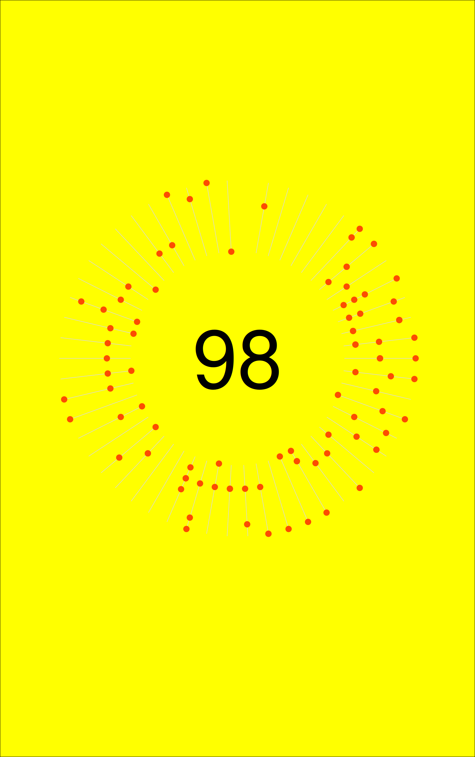
Then, you can change the colour of the top and bottom, as below.
g1 <- ggplotGrob(p2)

# filling with no border line
rect_red = rectGrob(gp = gpar(col = NA, fill = "#fc4c02"))
rect_black = rectGrob(gp = gpar(col = NA, fill = "black"))
rect_white = rectGrob(gp = gpar(col = NA, fill = "white"))

# library(gtable)

# add to the left and right
# for(i in c(1, 9)) g1 = gtable_add_grob(g1, rect_black, t = 1, b = 12, l = i)

# add to the bottom
for(i in c(6, 12)) g1 = gtable_add_grob(g1, rect_white, t = i, l = 1, r = 9)

# add to the top
for(i in c(1, 6)) g1 = gtable_add_grob(g1, rect_red, t = i, l = 1, r = 9)

grid.arrange(g1)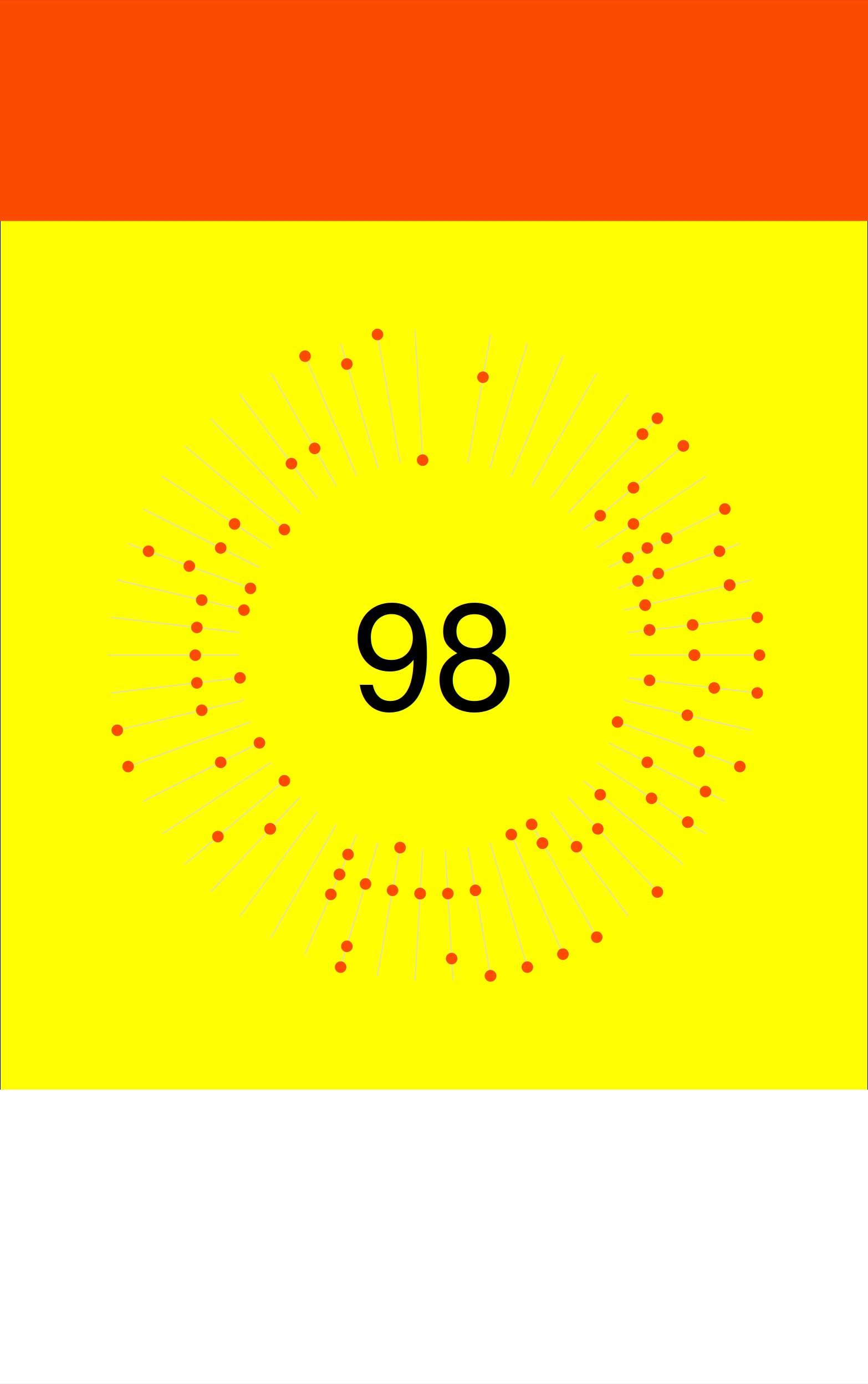
# The call below does add text to the figure, but overrides background colours
# p2 +
#   labs(title="TOTAL DAYS ACTIVE") +
#   theme(plot.title = element_text(family = "sans", size = 35, hjust = 0.2, margin = margin(b = 70) ) )
Add caption text outside ggplot
The final thing I wanted to add is text in the coloured parts outside the plot, but I couldn’t get this working properly. I mostly based this on the guide posted here.
It could well be that the code block defining colours of the top and bottom rectangles are not the only approach, and perhaps not the best either, and this and the code below can best be approached differently. This is not something that I normally use, so a bit too far out of my comfort zone here, and didn’t want to spend too much time on it. I’ll just leave the code here, and perhaps someday someone will explain to me what went wrong.
# Add texts
# Labels grob
left.title = textGrob("TOTAL DAYS ACTIVE", x = 0, y = 0.9, just = c("left", "top"),
                      gp = gpar(fontsize = 5, fontfamily = "Liberation Sans", fontface = "bold"))
labs.title = gTree("LabsTitle", children = gList(left.title))

left.head = matrix(list(left.title), nrow = 1)
head = gtable_matrix(name = "Heading", grobs = left.head,
                     widths = unit(1, "null"),
                     heights = unit.c(unit(1.1, "grobheight", left.title) + unit(0.5, "lines")))

# Put the labels in their place
# g1 <- gtable_add_grob(g1, labs.foot, t=7, l=2, r=4)
g1 <- gtable_add_grob(g1, head, t=1, l=2, r=4)
grid.arrange(g1)
Make it your own
Of course, when you can recreate a plot like this, you can further edit it to make it into something you like best. Change the colours, add more info in the data, etc.
For instance, change the background. Have point colours depicted type of ride, and add point size depicting distance biked. How else can you boast about those 200+km rides? ;)
Two plots made with colours using the feather palette packege, which contains a selection of colour palettes inspired by the plumage of Australian birds. You can find it here.
Rose-crowned Fruit-Dove (Ptilinopus regina):
bg_col <- get_pal("rose_crowned_fruit_dove")[c(3)]
lines_col <- get_pal("rose_crowned_fruit_dove")[c(5)]
qual_col2 <- get_pal("rose_crowned_fruit_dove")[c(1,8)]
nr_col <- get_pal("rose_crowned_fruit_dove")[c(2)]

p3 <- dist_2020 %>%
  ggplot(aes(x = weeknumber, y = weekday)) +
  # geom_point(alpha = 0.5, aes(colour = virtual, size = dist_km)) +
  # geom_vline(xintercept = c(1:53), colour= "lightgrey") +
  geom_segment(data = df2, aes(x = weeknumber, y = lower, xend = weeknumber, yend = upper), colour = lines_col, size = 0.3) +
  # geom_point(colour = "#fc4c02", size = 3) +
  geom_point(aes(colour = virtual, size = dist_km)) +
  scale_x_discrete(breaks = 1:53) +
  coord_polar() +
  theme_void() +
  # add dummy variables to y-axis, to create hole in the middle of your circular plot (Empty * n) and bit of space on the outside (EmptyOut)
  scale_y_discrete(limits = c("Empty", "Empty", "Empty", "Empty", "Empty", "Empty", "EmptyIn", "Empty", "Monday", "Tuesday", "Wednesday", "Thursday", "Friday", "Saturday", "Sunday", "EmptyOut"),
                   # breaks = c("Empty", "Monday", "Tuesday", "Wednesday", "Thursday", "Friday", "Saturday", "Sunday"),
                   drop = FALSE) +
  theme(plot.background = element_rect(fill = bg_col)) + # change colour background
  scale_colour_manual(values = qual_col2) +
  annotate("text", x=0, y=0, label = nrow(dist_2020), size = 35, colour = nr_col) +
  theme(legend.position = "none") # remove colour and size legends

p3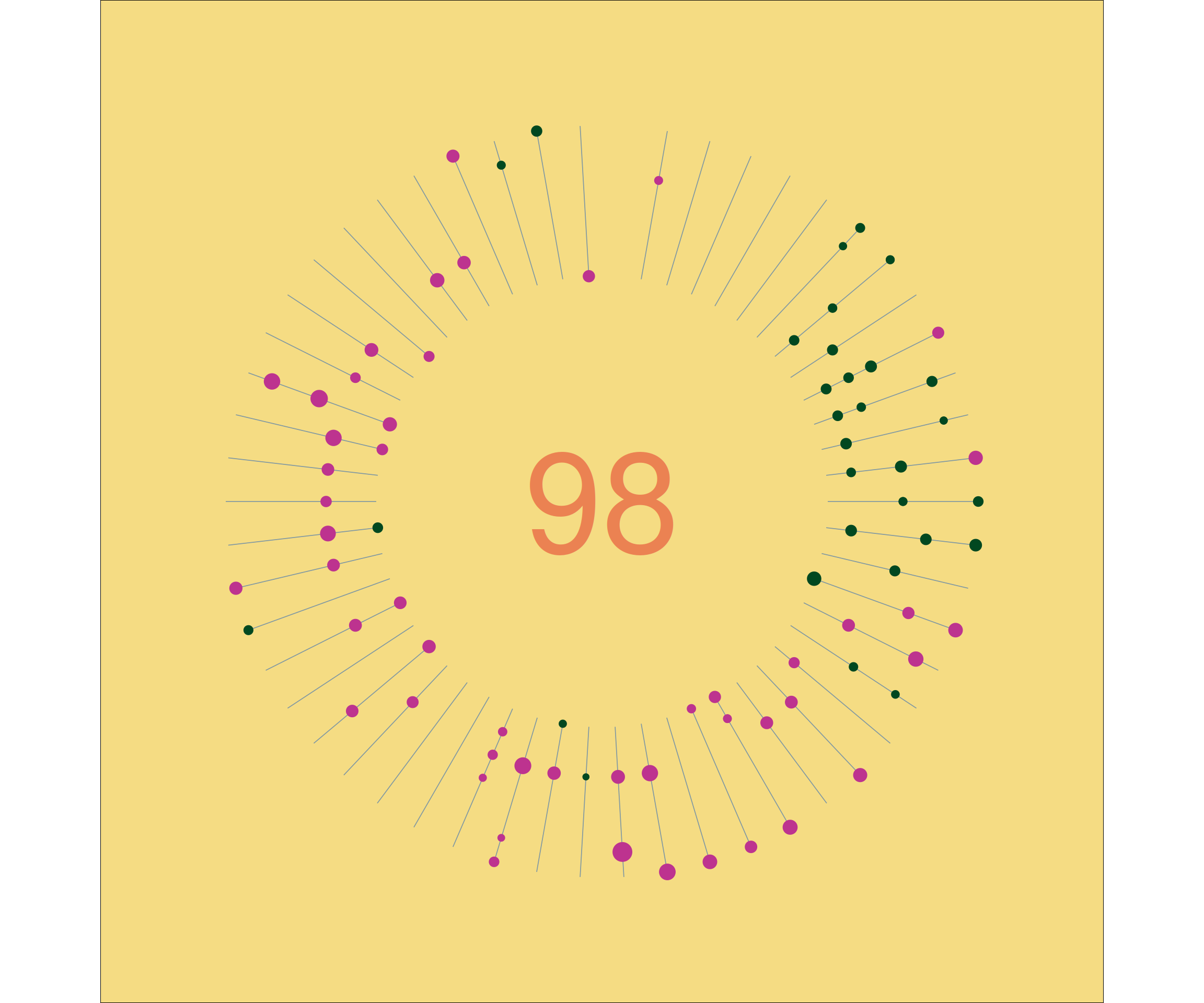
Rainbow Bee-eater (Merops ornatus):
bg_col <- get_pal("bee_eater")[c(7)]
lines_col <- get_pal("bee_eater")[c(3)]
qual_col2 <- get_pal("bee_eater")[c(4,5)]
nr_col <- get_pal("bee_eater")[c(2)]

p4 <- dist_2020 %>%
  ggplot(aes(x = weeknumber, y = weekday)) +
  # geom_point(alpha = 0.5, aes(colour = virtual, size = dist_km)) +
  # geom_vline(xintercept = c(1:53), colour= "lightgrey") +
  geom_segment(data = df2, aes(x = weeknumber, y = lower, xend = weeknumber, yend = upper), colour = lines_col, size = 0.3) +
  # geom_point(colour = "#fc4c02", size = 3) +
  geom_point(aes(colour = virtual, size = dist_km)) +
  scale_x_discrete(breaks = 1:53) +
  coord_polar() +
  theme_void() +
  # add dummy variables to y-axis, to create hole in the middle of your circular plot (Empty * n) and bit of space on the outside (EmptyOut)
  scale_y_discrete(limits = c("Empty", "Empty", "Empty", "Empty", "Empty", "Empty", "EmptyIn", "Empty", "Monday", "Tuesday", "Wednesday", "Thursday", "Friday", "Saturday", "Sunday", "EmptyOut"),
                   # breaks = c("Empty", "Monday", "Tuesday", "Wednesday", "Thursday", "Friday", "Saturday", "Sunday"),
                   drop = FALSE) +
  theme(plot.background = element_rect(fill = bg_col)) + # change colour background
  scale_colour_manual(values = qual_col2) +
  annotate("text", x=0, y=0, label = nrow(dist_2020), size = 35, colour = nr_col) +
  theme(legend.position = "none") # remove colour and size legends

p4